The essentials
Project snapshot
- Client
- GM Beauty, Georgia Millis (Registered Nurse and professional makeup artist)
- Studio
- Studio Fullstack
- My role
- UX/UI design, brand system, copywriting, front end code, Wix Studio build, client handoff
- Platform
- Wix Studio
- Tools
- Figma, Figma to Wix plugin, HTML, CSS and JavaScript, Acuity Scheduling
- Live site
- www.gmbeauty.com.au ↗
- Year
- 2026
The scope
What I delivered
- Brand system and brand guidelines (logo usage, palette, type, tone of voice)
- A nine page site: Home, About, Aesthetics, Artistry, Portfolio, Contact, Book, Terms & Conditions, Privacy Policy
- Desktop, tablet and mobile layouts
- Full site copy written to TGA and AHPRA cosmetic advertising rules
- Custom code embeds: an animated marquee banner and a branded booking calendar
- The Wix Studio build, with a contact form, map, testimonial slider and online booking
- A client review checklist and Wix Studio feedback walkthrough
The starting point
The brief
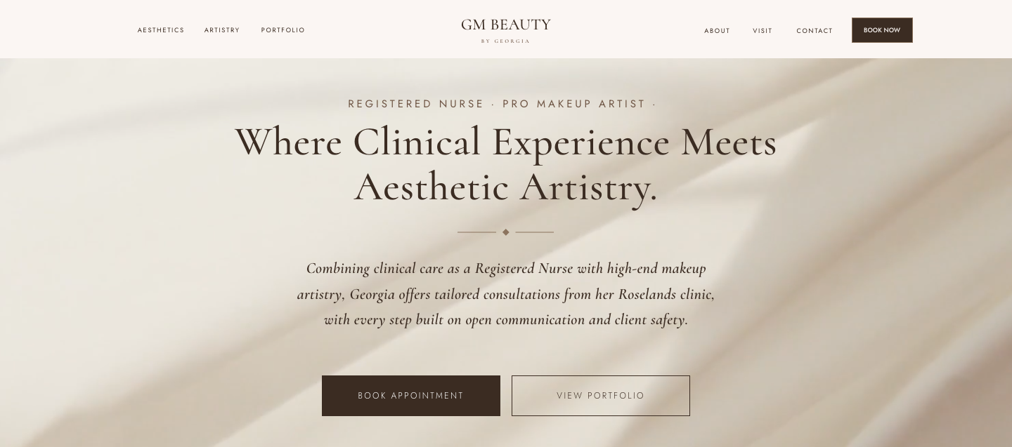
Georgia is a Registered Nurse and a professional makeup artist, working out of one studio. That combination is rare, and it was the whole brand. The site had to hold both sides without one cheapening the other.
Three things made this harder than a standard beauty site:
- Two very different services. Makeup can be marketed emotionally. Cosmetic nursing legally can't.
- Strict advertising rules. Cosmetic nursing in Australia sits under TGA and AHPRA rules, which ban a lot of the language beauty sites normally lean on.
- It had to survive the move into Wix Studio. Every layout needed to reflow cleanly on any screen.
The visual language
The brand system: Glam Taupe
Eight warm neutrals, two typefaces and one small ornament, used with a lot of restraint.
#FBF6F3#F8F2ED#FEFCFA#E7DDD3#B8A692#8C745E#6E5544#3B2C22Soft and editorial.
Clean and modern.
BODY AND SMALL CAPS
Type: Cormorant for display, soft and editorial. Jost for body and small caps, clean and modern. It reads glam without tipping into wedding invitation.
The diamond ornament: a tiny diamond motif sits between headings and text across the site, tying the pages together without adding noise.
Light and dark rhythm: the page moves between light cream bands and deep espresso ones, with a taupe marquee strip under the hero. It keeps a neutral palette from feeling flat.
Texture: the hero, contact and call to action sections sit on soft, shadowy photographic backgrounds for warmth and depth.
Accessibility: cream on espresso is 12.5:1 and cream on mocha is 6.4:1, both passing WCAG AA.
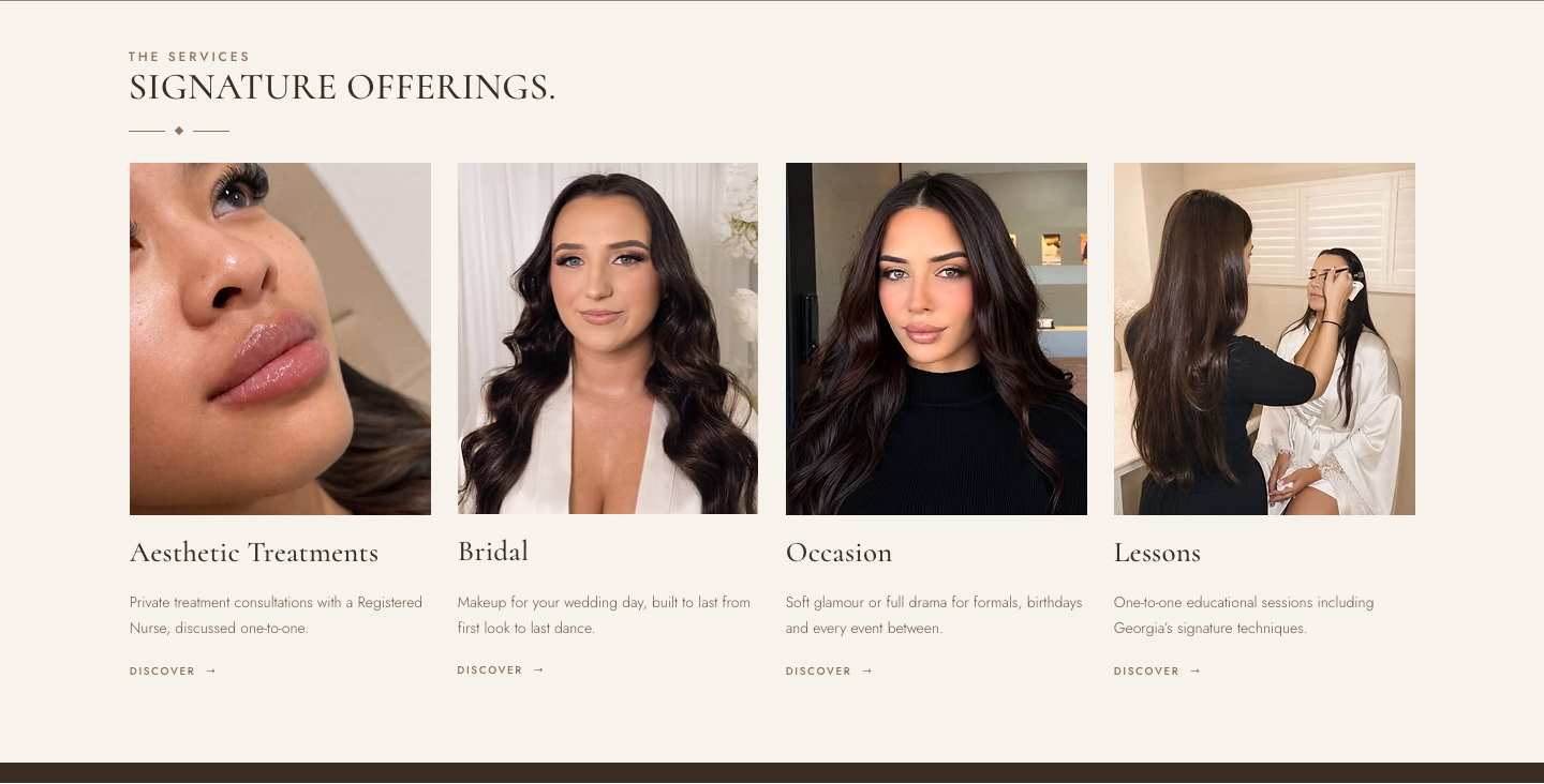
Making the two sides feel connected
Site structure
I mapped the site in a sitemap before designing any pages, so Georgia could see how everything connected.
- Home
- Centred hero, marquee, four signature offerings, Meet Georgia, client testimonials, Visit the Clinic with a map, final call to action
- About
- “Hi, I'm Georgia.” Her story from makeup brushes to nursing, and her approach: listen first, give an honest opinion, no pressure
- Aesthetics
- Cosmetic nursing explained through the consultation: Talk, Assess, Advise
- Artistry
- Bridal, Occasion and Lessons, each with what's included, plus her bridal assistant
- Portfolio
- A makeup gallery and her skin first philosophy
- Contact
- Enquiry form, details, FAQs and a “Rather book in?” call to action
- Book
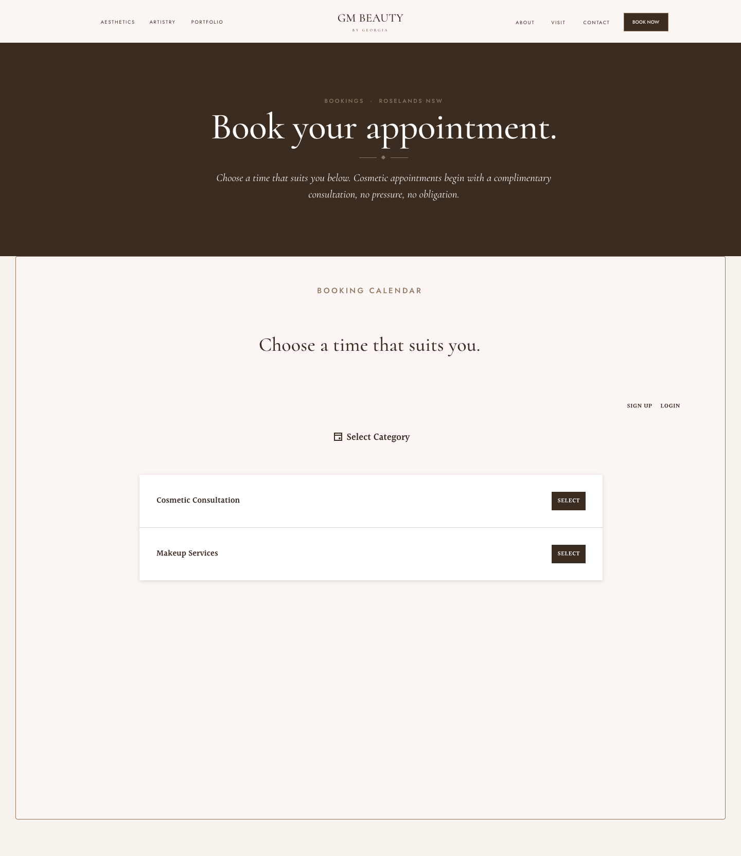
- Live booking calendar, split into Cosmetic Consultation and Makeup Services
- Terms & Conditions and Privacy Policy
The navigation splits the logo down the middle, with services on the left, About, Visit and Contact on the right, and a Book Now button always in reach.

The layout, at every size
Responsive across every screen
I designed dedicated desktop (1440px), tablet (810px) and mobile (390px) layouts. Responsive design is about how a layout changes, not just shrinking it. Services go from 4 across, to a 2 by 2 grid, to a single column. Sections stack and centre on mobile, buttons go full width, and type scales down at each step so everything stays in proportion.
Designing for the platform
Building the Figma file for Wix Studio
The Figma to Wix plugin only copies a design cleanly if the file is built the way Wix expects. So I audited every frame before handing anything over. The desktop layout had 41 freely positioned elements that Wix can't reflow.
I converted every section to auto layout, moved background images onto section fills, wrapped content in centred max width containers, set images to crop to their frames, and gave sections matching names across all three breakpoints so Wix lines them up automatically.
The result: zero freely positioned elements and zero reflow breakers across all three breakpoints.
Finding the right words
Copywriting and compliance
I wrote the copy for every page, then rewrote it twice: once to make it sound human, and again to meet TGA and AHPRA rules.
What compliance changed:
- No words like “injectable” or “injector”, and no named treatments
- No outcome promises on the clinical side
- No prices or before and after photos for clinical services
- Testimonials kept to makeup work
Factual, consultation led information is the safe lane for clinical content. So the Aesthetics page opens with “It starts with a conversation.” and walks through three steps: Talk, Assess, Advise. Makeup does the emotional selling, which is fully allowed.
I also turned the rules into a trust point. The Contact FAQs answer “Why aren't treatments and prices listed online?” directly, so the missing price list reads as care, not as something hidden.
The homepage headline holds both sides of the business in one line: “Where Clinical Experience Meets Aesthetic Artistry.”
The finishing touches
Custom code embeds
- Animated marquee banner: a seamless scrolling band under the hero, set in Cormorant on taupe with the diamond motif between each phrase.
- Branded booking calendar: Georgia's Acuity Scheduling calendar set inside a custom frame that matches the site, so booking feels like part of GM Beauty, not a third party page.
Bringing it all together
The Wix Studio build
Because the Figma file was built for Wix from the start, moving it across was predictable, not a rebuild. I uploaded the brand fonts, copied each breakpoint across, added my embeds, built the enquiry form with a service dropdown, added an interactive map pinned to the clinic, turned the testimonials into a slider, swapped in Georgia's own photography, and wrote search friendly page titles built around her services and suburb.
Ready for Georgia
Client handoff
- A review checklist written in my own voice, covering words, photos, pages, booking and overall feel
- A simple walkthrough for Wix Studio's feedback link, so Georgia could comment straight onto the page
- Clear scope: two rounds of revisions included, bigger changes discussed separately
Out in the world
Outcome
GM Beauty is live at www.gmbeauty.com.au. Georgia now has a custom site that holds both sides of her business, reads as elevated, stays inside the advertising rules and takes bookings online.
What I'm proudest of:
- Turning a legal constraint into a design idea. The calm clinical side and the warm makeup side became the brand's personality.
- A Figma file built for its platform, so the Wix build was small edits, not a rebuild.
- Booking that feels like part of the brand.